The Latest in Digital Landscape Architecture 2018 – Conference Report

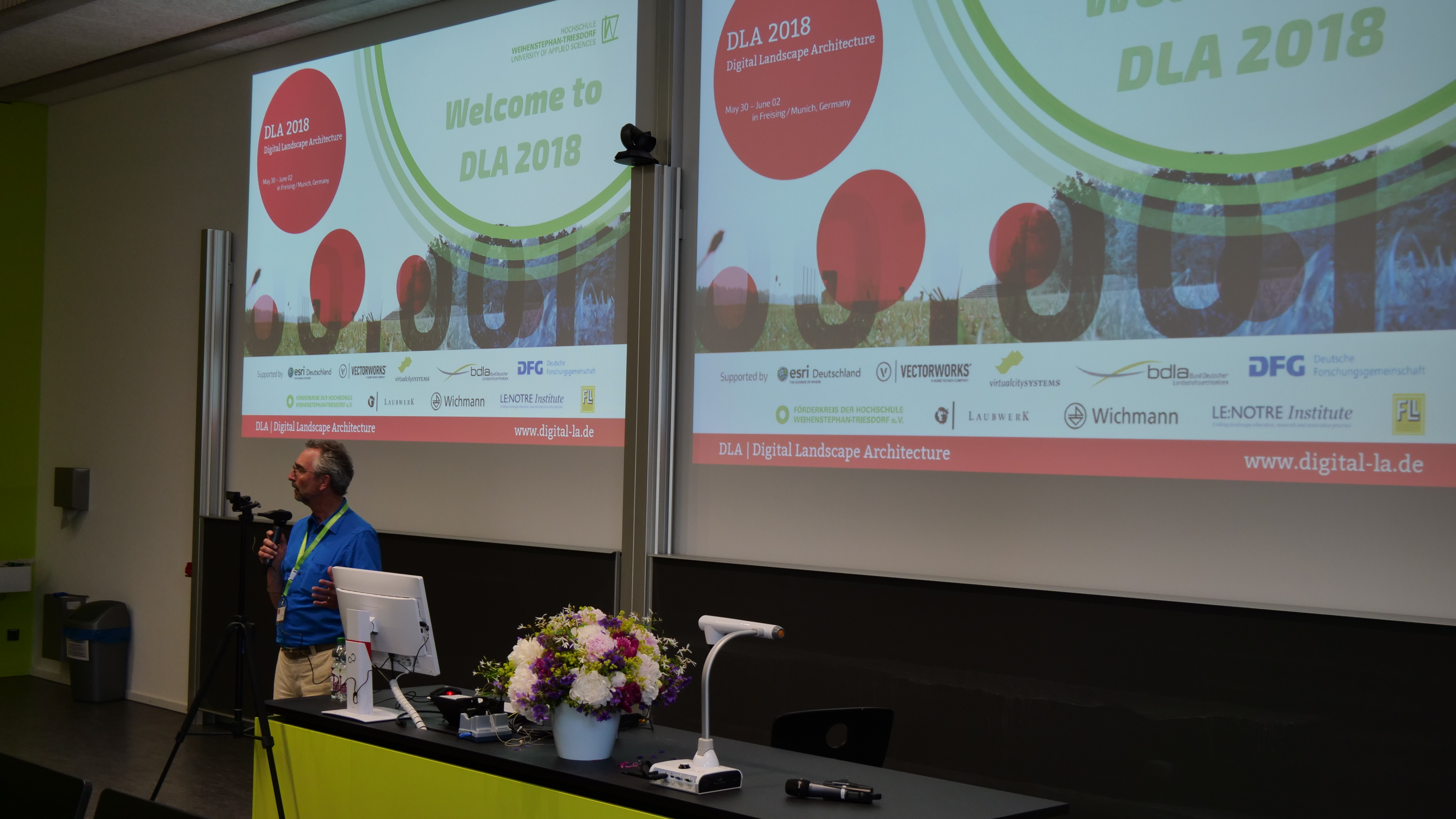
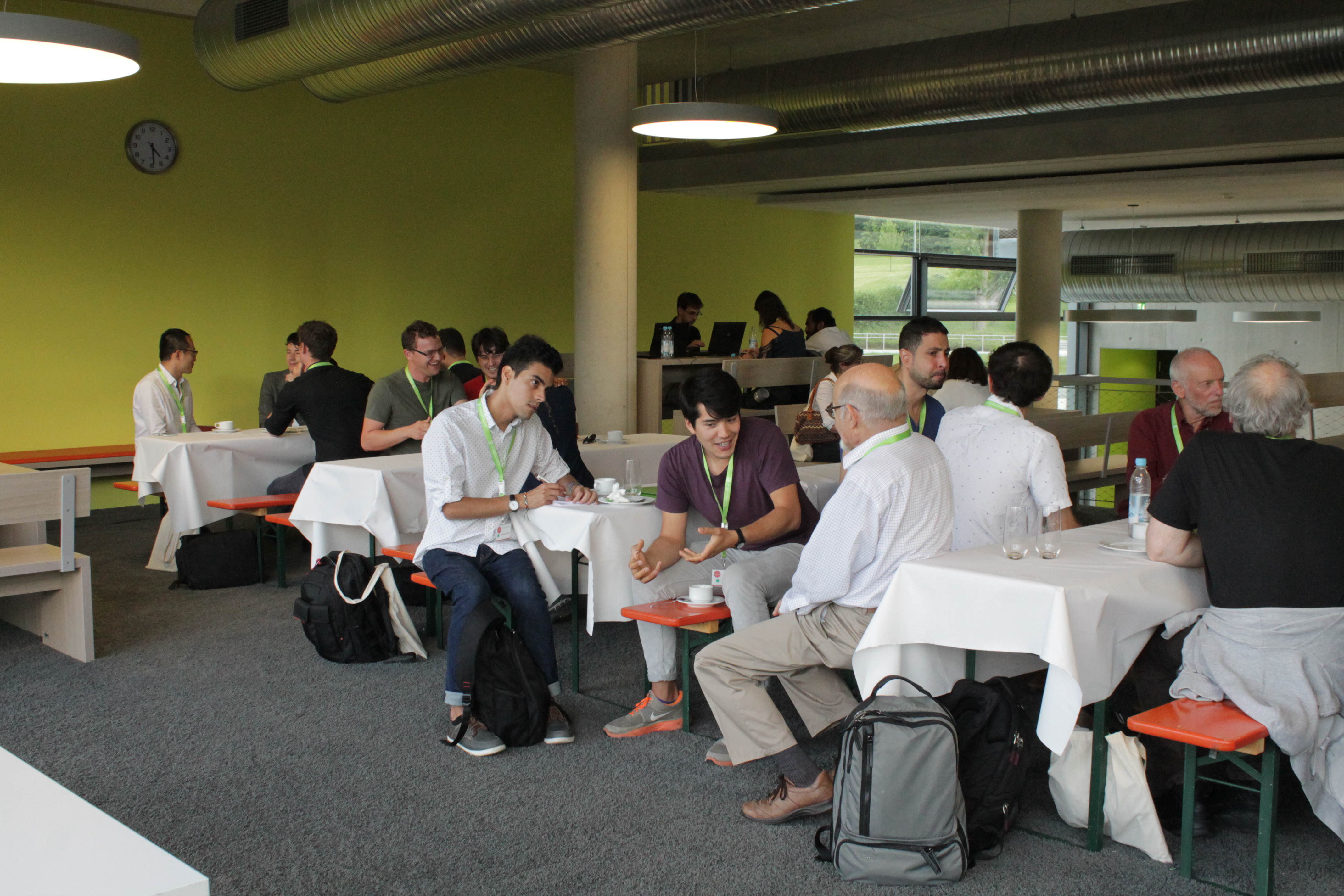
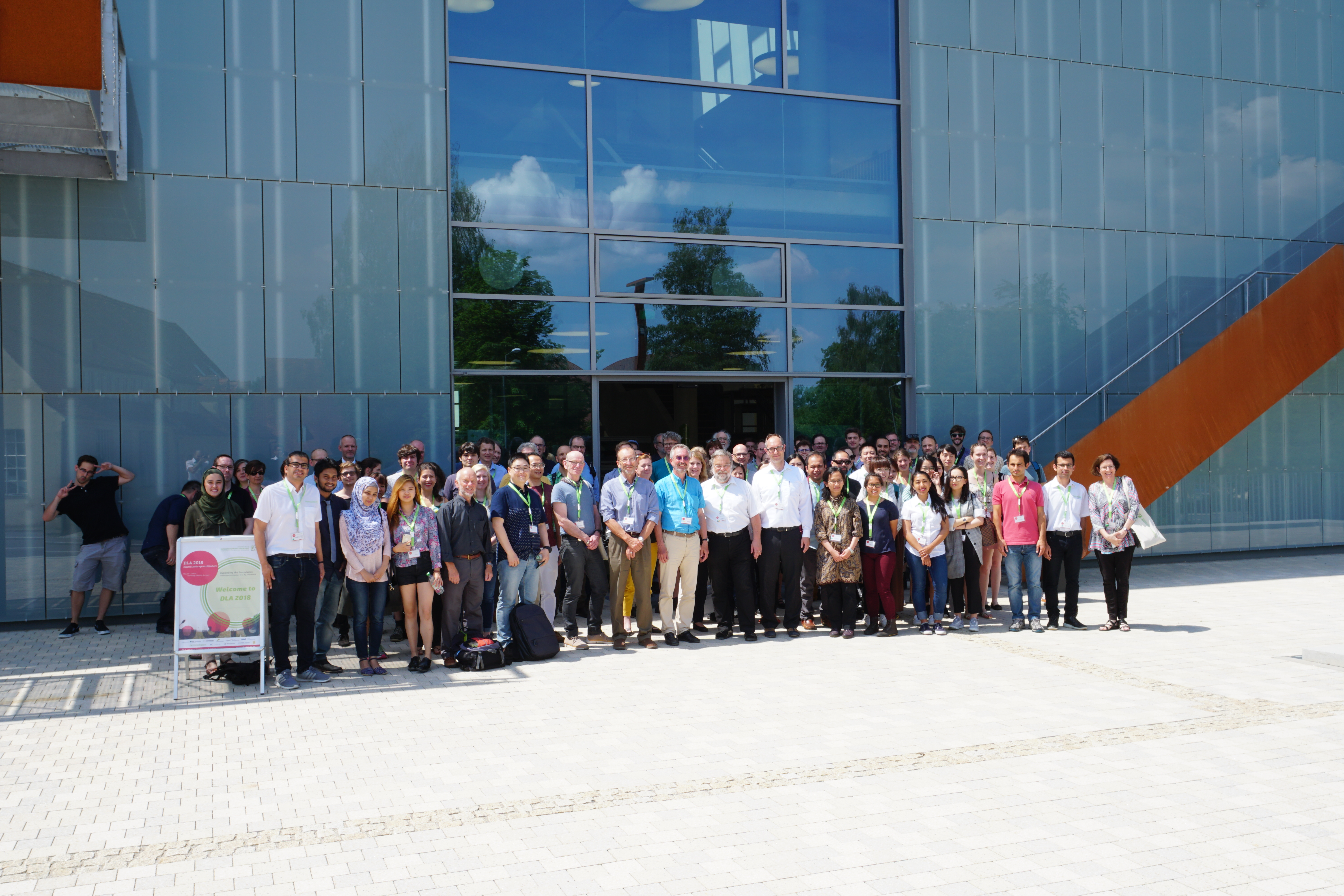
Knowledge transfer at a very high scientific level: the Digital Landscape Architecture Conference 2018 at Weihenstephan-Triesdorf (HSWT) hosted 130 participants from 22 countries from May 30th to June 2nd discussing the latest research and applications of information technology in landscape architecture. At the same time, the conference honored 30 years of landscape informatics through Prof. Dr. Ulrich Kias.

The conference started with a geodesign workshop run by Harvard professor Carl Steinitz and his colleague Olaf Schroth at HSWT, since 2017 professor of geodesign and landscape informatics at HSWT. In the workshop, six stakeholder groups developed and negotiated different scenarios for the area between Olympic Park and city´s edge in the north of Munich. The workshop was facilitated through the open online platform geodesignhub.

Other international scientists and practitioners, who gave key notes, were Prof. Joan Nassauer,  University of Michigan, Prof. Kelleann Foster, Pennsylvania State University, Prof. Stephan Sheppard, University of British Columbia and Mike Shilton of the Landscape Institute in England. The public talk by Dr. Jörg Rekittke, addressing the “Challenges and approaches of landscape research and design in the global south”, was also highly appreciated by the audience.

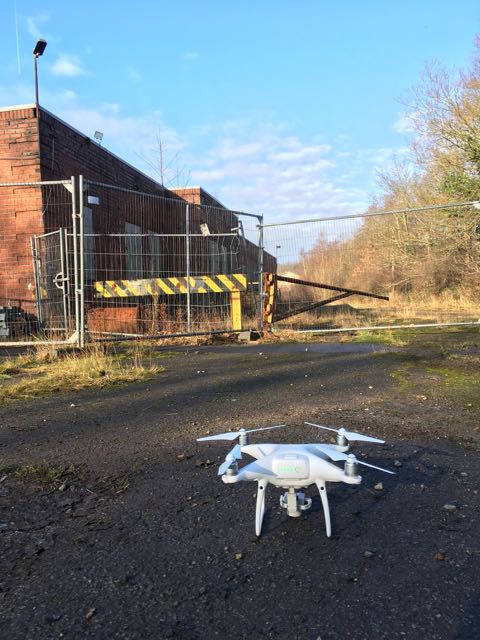
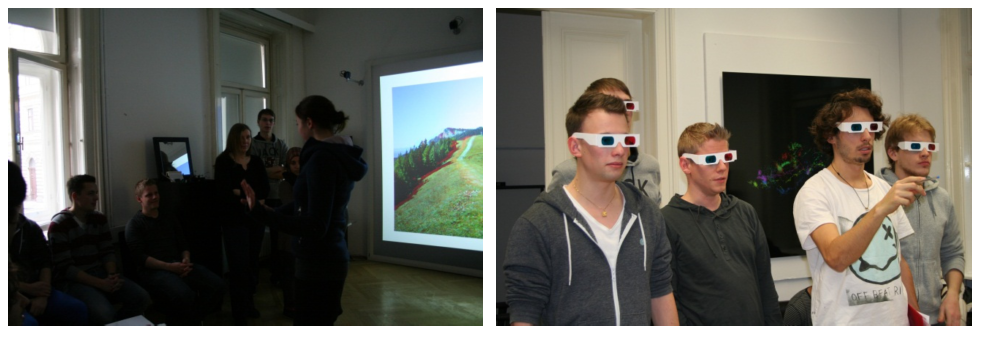
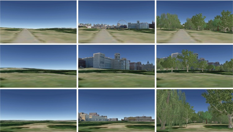
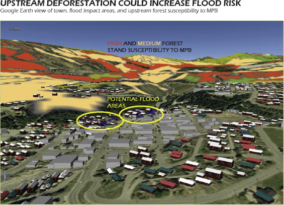
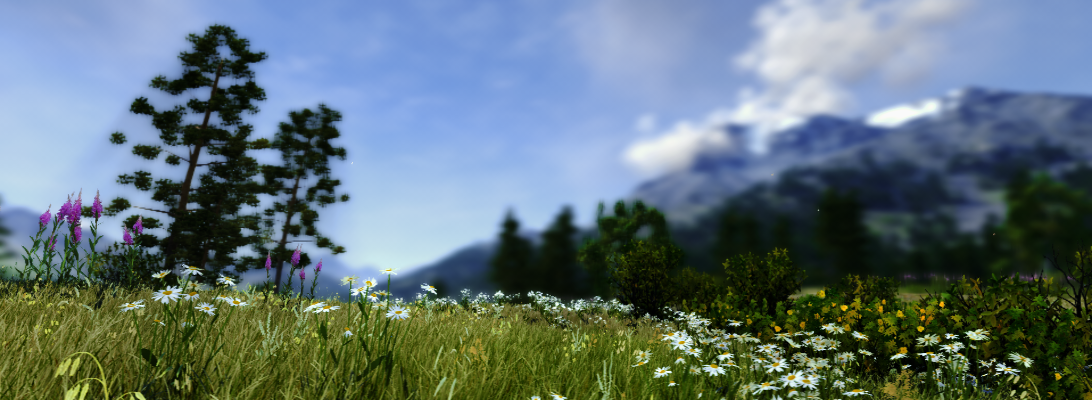
In addition to key notes, the various lecture sessions addressed the themes geodesign and climate change, big data in landscape architecture, Building Information Models (BIM), drones/UAVs for data survey, social media and VR/AR. Various speakers demonstrated the latest developments and applications in practice examples such as the use of high resolution laserscanning data and digital terrain models, the use of environmental sensors and VR/AR displays.

If you are now interested, the next DLA conference will take place in Dessau in 2019 and celebrate the 20th anniversary of the conference series and in 2020, the well-established Harvard Graduate Design School will host the 21st DLA. For more information please see the conference website at dla.hswt.de.

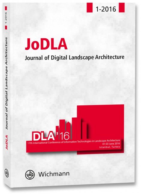
Papers and key notes can be downloaded at: gis.point

EU BIM Handbook

The #EU #BIM Task group has published their handbook on how to introduce BIM in the public sector: https://www.buildingsmart.de/kos/WNetz?art=File.download&id=6689&name=EU_BIM_Task_Group_Handbook_FINAL.PDF

EU BIM Handbook

New research paper on the use of drones in Landscape & Urban Planning

Using unmanned aerial vehicle data to assess the three-dimension green quantity of urban green space: A case study in Shanghai, China

The drone in the photo is not related to the research article below but our own drone.

Urban green space (UGS), which plays an important role in reducing the problems associated with urbanization, needs to be evaluated by metrics. Three-dimension green quantity (3DGQ), a quantitative index that measures the crown space occupied by a growing plant, is often used to evaluate the extent, and the environmental and climatic benefits of UGS. The objective of this study was to measure the 3DGQ of Paotaiwan Wetland Park (PWP) in Shanghai, China. Implementation of the 3DGQ index was supported by remote sensing (RS) images taken by an unmanned aerial vehicle (UAV). The 3DGQ calculations for 100 species of trees were used to calculate the 3DGQ of the UGS in PWP. The environmental and climatic benefits of UGS in PWP were also evaluated. The 3DGQ for the whole PWP was 668,624.13 m3. The mixed woods in the PWP annually absorbed 1,635.57 t CO2, 2.03 kg SO2, 735.48 t dust, and 2,254.49 t of O2. There was 367.74 t of diurnal transpiration. The lowered temperature of the PWP in the transpiration scope at 100 m altitude was 1.8 °C. The use of a UAV to assess UGS could help planners and policy makers to improve the environmental and climatic benefits of UGS.

Full paper: https://doi.org/10.1016/j.landurbplan.2017.04.006

A picture is worth a thousand data points: Exploring visualizations as tools for connecting the public to climate change research

Labelled elements of an interactive visualization of secondary energy production and consumption in Canada from 1960 to 2010.

In this newly published open source paper, Robert Newell, Ann Dale and Celia Winters at Royal Roads University in BC investigated the efficiency and effectiveness of interactive data visualisations in the commmunication of building energy production and consumption. Two visualizations were built that held contrasting features: an abstract, static visualization built in the form of a time-series graph and a dynamic, interactive visualization with a ‘picturesque’ design. The results indicate that the interactive visualization held higher potential for drawing in and maintaining audience interests, whereas the static visualization was more useful for users wishing to gain a more detailed understanding of the data. These findings suggest that both types of visualizations have complementary strengths, and collaboration between trans-disciplinary research teams and graphic artists can lead to visualizations that attract diverse audiences and facilitate different information needs and access.

In addition to the most interesting research, the paper itseld includes some interactive PDF features inherently picking up the topic of interactivity in its own presentation.

Link to the paper


Research paper comparing 2D versus 3D landscape visualisations with regard to economic valuation

2D seminar room (a); and 3D presentation in the spatial lab (b) of the Vienna University of Technology (source: Getzner et al. 2016)
2D seminar room (a); and 3D presentation in the spatial
lab (b) of the Vienna University of Technology (source: Getzner et al. 2016)

In this fully open access paper, Michael Getzner, Barbara Faerber and Claudia Yamu compare 2D versus (stereoscopic) 3D landscape visualisations of different landscape scenarios in the Alps. Although there have been previous studies of landscape visualizations of alpine scenarios, I found that this paper is adding a couple of particularly new perspectives: a) the use of stereoscopic (anaglyph) visualisations and b) the link to the economic valuation of different landscapes through the participants. It should be said that this study like many others was conducted with students. However, I think it provides the legitimization to use landscape visualisations for other studies on the economic valuation of such landscapes.


Save

Save

New publication series on Digital Landscape Architecture

Journal of Digital Landscape Architecture


Buhmann, Erich; Ervin, Stephen; Hehl-Lange, Sigrid; Palmer, James (Hrsg.)

JoDLA – Journal of Digital Landscape Architecture 1-2016

17th International Conference of Information Technologies in Landscape Architecture 01-03 June 2016, Istanbul, Turkey

2016, X, 374 Seiten, 170 x 240 mm, Broschur
ISBN 978-3-87907-612-3

This is the first issue of the new Journal of Digital Landscape Architecture. JoDLA addresses all aspects of digital technologies, applications, information, and knowledge bases in research, education, and practice pertaining to landscape architecture and related fields. The journal publishes original papers that address theoretical and practical issues, innovative developments, methods, applications, findings, and case studies that are drawn primarily from work presented at the annual international Digital Landscape Architecture conference. Its intent is to encourage the broad dissemination of these ideas, innovations, and practices.

This issue of the Journal of Digital Landscape Architecture, 1-2016, presents contributions from the 17th annual conference at the Technical University, Istanbul, Turkey, (June 1 to 3, 2016) covering five broad themes:

• Systems Thinking in Landscape Design Processes
• Landscape Visualization and Analysis
• Geodesign Concepts and Applications
• Mobile Devices for Geodesign
• Teaching Methods in Digital Landscape Architecture

Link to the publisher for ordering

New research paper on sound in landscape visualisation

Ass. Prof. Dr. Mark Lindquist, who completed his PhD at the Department of Landscape at the University of Sheffield, just published a paper in Landscape and Urban Planning summarizing his findings about the contribution of sound to the perception of landscape visualisations.

His key research findings are:

  • Sound significantly alters perceptual responses to 3D landscape visualizations.
  • Realism and preference are moderated by congruency of visual and sound content
  • Eye level Google Earth visualizations receive low realism ratings.
  • Aural-visual survey data collected via the web is comparable to laboratory data.
  • Sound and visuals that are spatiotemporally congruent are recommended for simulations.

You can read and download the fully accessible open source paper by Lindquist, Lange and Kang (2016) here: From 3D landscape visualization to environmental simulation: The contribution of sound to the perception of virtual environments

Views and landscape elements used in the research: view 1 (top row); view 2 (middle row); view 3 (bottom row); by visual condition (1 left column; 2 middle column; 3 right column) (©Google Earth).


Information Technology and Renewable Energy

Special issue released: The April 2015 issue of Environmental Impact Assessment Review, edited by Lorenz Hilty and Bernd Page, provides an overview of ICT-based approaches to facilitate the assessment of renewable energy solutions.

http://www.sciencedirect.com/science/journal/01959255/52

Special Issue: Critical Approaches to Landscape Visualization

Special Issue on Critical Visualization

Recent advances in landscape visualization have dramatically increased our ability to portray past, present, and future conditions across a range of scales from site to region, altering the ways in which people perceive their environments and influencing changes in social and cultural practices. While landscape architects and planners have long employed representational methods, the proliferation of new digital technologies for visualization is rapidly outpacing the theoretical grounding needed to meaningfully guide design and planning outcomes. This special issue attempts to bridge this practice–theory gap by bringing together diverse contemporary practices, methods, and theoretical perspectives in order to build a shared understanding of the relationships between visualization techniques and the knowledge they produce.

http://sites.psu.edu/dogblog/critical-visualization/

*** The full issue is open access until Nov. 20 ***

Special Issue: Critical Approaches to Landscape Visualization
Edited by Katherine Foo, Emily Gallagher, Ian Bishop and Annette M. Kim
Landscape and Urban Planning, Volume 142, Pages 1-244, October 2015

Evaluating presentation formats of local climate change in community planning with regard to process and outcomes

I am excited to present the following research paper in Landscape and Urban Planning because it summarizes the work my colleagues and I put into my favorite research project, the Kimberley Climate Adaptation Project KCAP. It was very rewarding working closely with the local community, visualizing different development scenarios and their interactions with climate change impacts. Great to see that about 70 recommendations from the original visioning process were adopted in various policy documents and a dozen actually implemented. The paper looks in more detail at one of the implemented mitigation measures, a flood retention area along the river that leads through Kimberley.

The paper is open access and can be downloaded for free at http://www.sciencedirect.com/science/article/pii/S0169204615000651

This figure shows the Kimberley town center with an overlay of potential flood areas as identified in the municipal flood risk study (highlighted through circles) and the areas for future mountain pine beetle susceptibility, derived from the susceptibility model (orange/dark shading in black/white for high susceptibility and yellow/light shading in black/white for medium). It led to the conclusion that increased mountain pine beetle damage will increase the amount of dead wood and therefore increase flood risk from debris jams at the highlighted bottlenecks (geodata© 2009 Google)

Reference:
Olaf Schroth, Ellen Pond, Stephen R.J. Sheppard, Evaluating presentation formats of local climate change in community planning with regard to process and outcomes, Landscape and Urban Planning, Available online 1 May 2015, ISSN 0169-2046, http://dx.doi.org/10.1016/j.landurbplan.2015.03.011.

Abstract:
This study synthesizes two evaluations of a local climate change planning process in a rural town in British Columbia (Canada), which was supported through landscape visualizations. First, the impact of the visualizations, based on scientific environmental modeling and presented in three different presentation formats, verbal/visual presentation, posters and a virtual globe, was evaluated with regard to immediate impacts during the process. Second, the long-term impacts on decision-making and actual outcomes were evaluated in a retrospective evaluation 22 months after the end of the initial planning process. Two results are highlighted: according to the quantitative pre-/post-questionnaires, the visualizations contributed to increased awareness and understanding. Most importantly, the retrospective evaluation indicated that the process informed policy, operational and built changes in Kimberley, in which the landscape visualizations played a role. The post interviews with key decision-makers showed that they remembered most of the visualizations and some decision-makers were further using them, particularly the posters. The virtual globe seemed to be not a “sustainable” display format suitable for formal decision-making processes such as council meetings though. That may change with the further mainstreaming of visualization technologies or mobile devices. Until then, we recommend using display formats that can be re-used following a specific planning event such as an Open House, to ensure on-going support for effective decision-making over the longer-term.

Research Highlights:
• Visualizations in a climate change planning process were assessed as very helpful by local stakeholders and residents.
• Visualizations presented in a virtual globe facilitated understanding and increased awareness during an open house.
• 22 months later most decision-makers still remembered or used the visualizations.
• Visualizations embedded into process informed policy, operational and built changes.
• Although the virtual globe presentation format was effective during the process it was less so in the long term.

Keywords:
Climate change; Participatory decision-making; Landscape visualization; Virtual globe; Process evaluation; Policy outcomes